"quilts"

Modern Mills and Stars from Perfectly Pretty Patchwork

Pretty in Patchwork Mills and Stars

Back when we could hang out with other people I had a lovely breakfast with Kristyne Czepuryk. We are lucky enough to live in the same city and get to hang out when our schedules allow. She shared a copy of her latest book with me. It is pretty and perfect and so bang on for her style, I love it. And right now, a lovely distraction from the real world. She asked me to make something from the book and share it as part of her book tour.

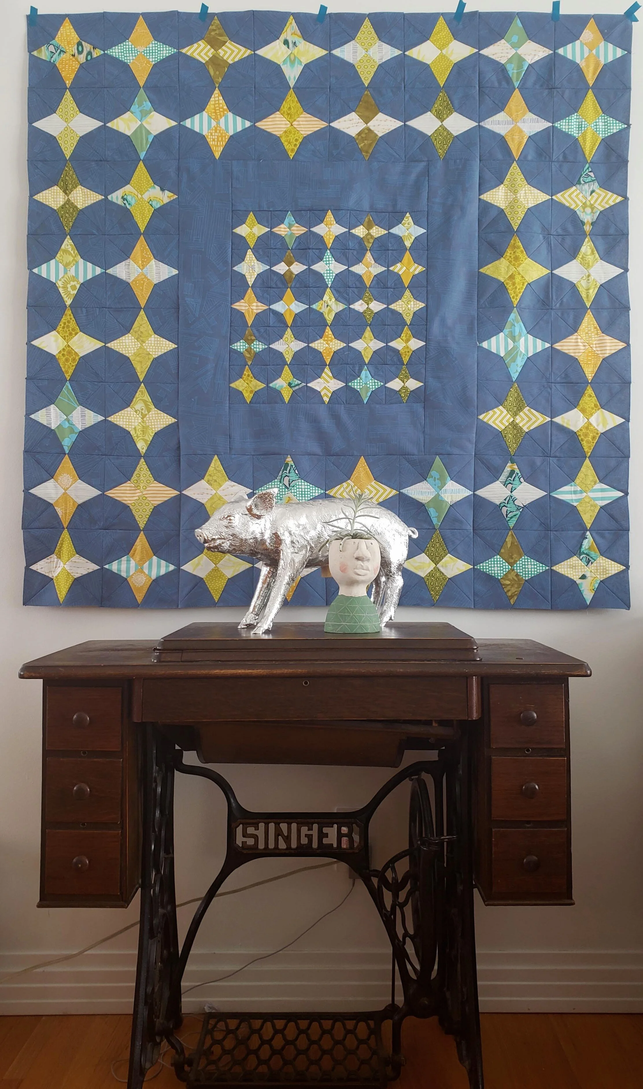
I chose the Mills and Stars pattern, one that has always appealed to me yet I’ve never made a single block. Because it is me, I changed up the colours quite a bit from Kristyne’s typical pastel palette. It works with the patterns in the book because they are classic, traditional patterns that be played with.

Mills and Stars can also be known by Hummingbird as well as Periwinkle. In fact, I remember Kristyne telling me the story of the block at that breakfast but it has slipped away from my brain.

Pretty in Patchwork Mills and Stars Quilt

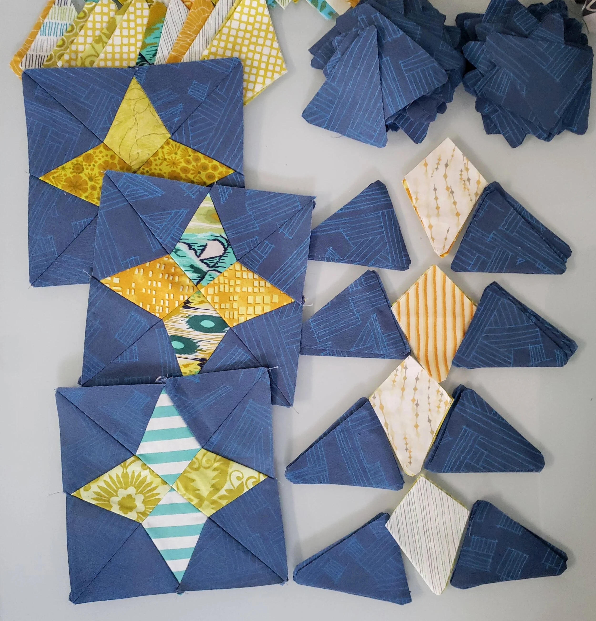
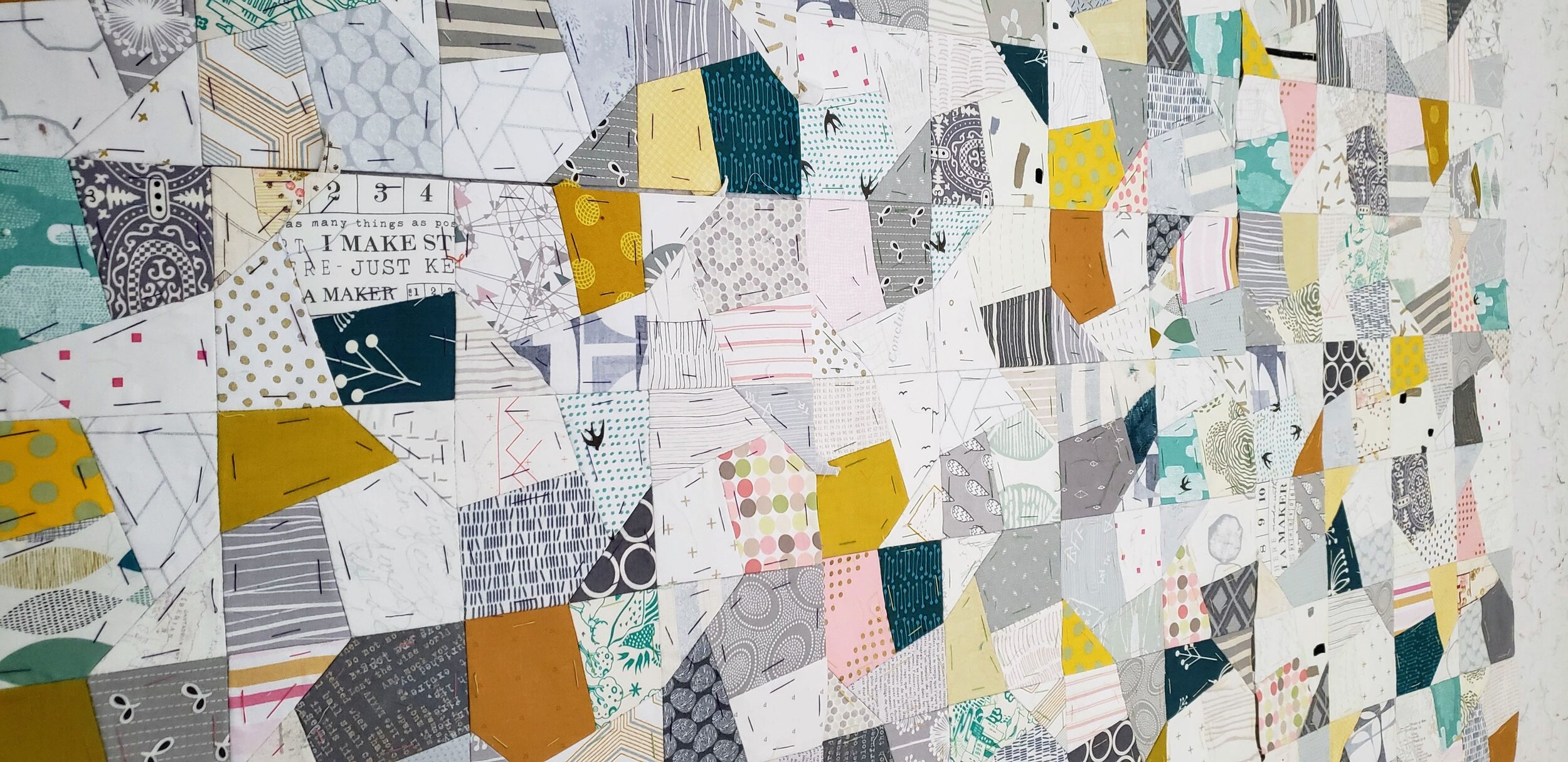
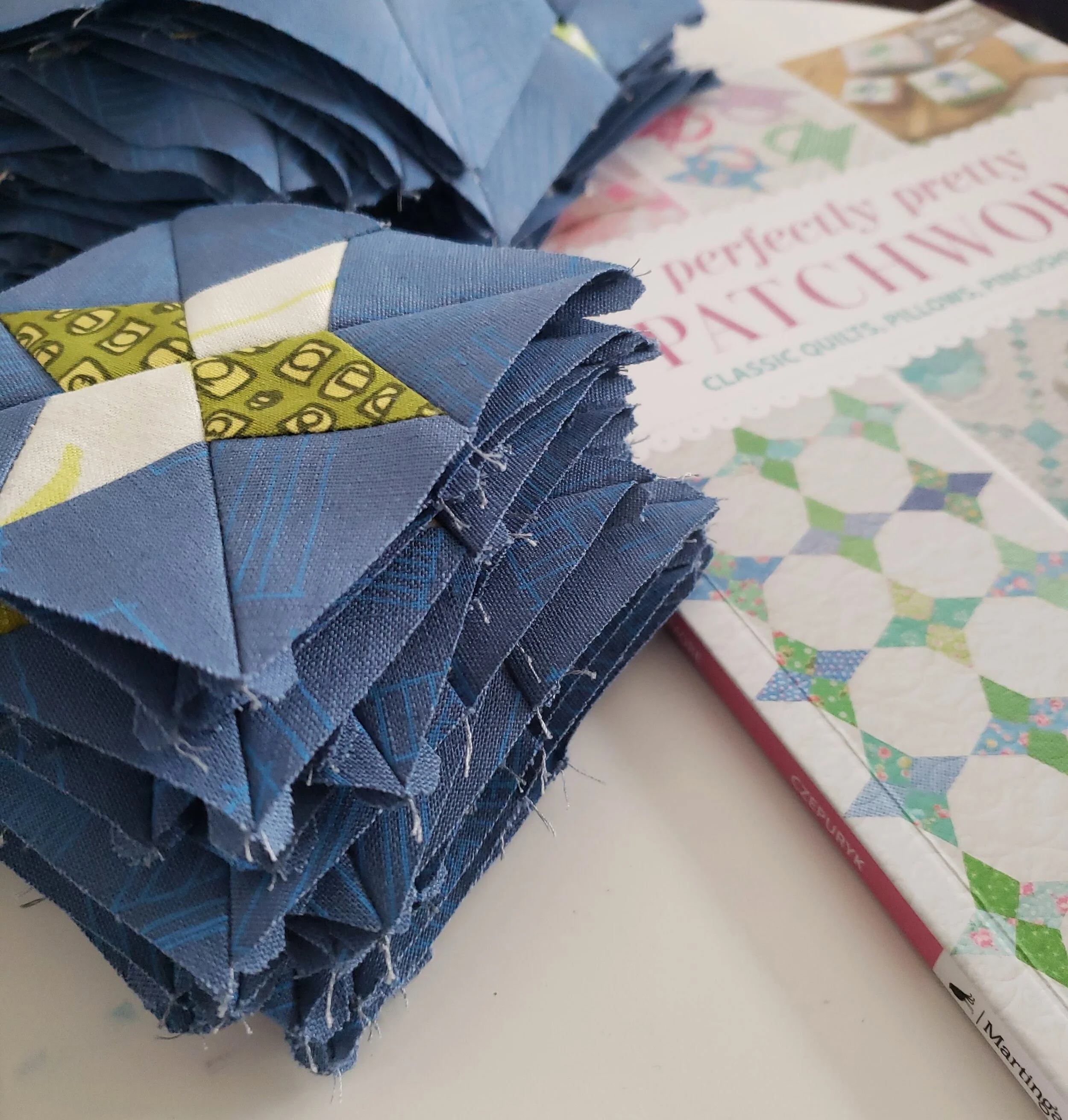
I won’t lie, this quilt was a lot of work, especially for me. I am decidedly not a template person. Yet there I was cutting out hundreds of pieces for 73 blocks, each with 12 pieces of fabric in them. (I watched/listened to Fleabag, Dr. Thorne, and Austenland while I worked on it. Whatever it takes!) In the end, however, it was welcome work. A respite from the world to just get lost in someone else’s decision making. Once all the cutting is done it just becomes assembly line production. I always forget how fast the sewing goes when you’ve cut everything in advance. I did eventually finish.

Mills and Stars from Perfectly Pretty Patchwork

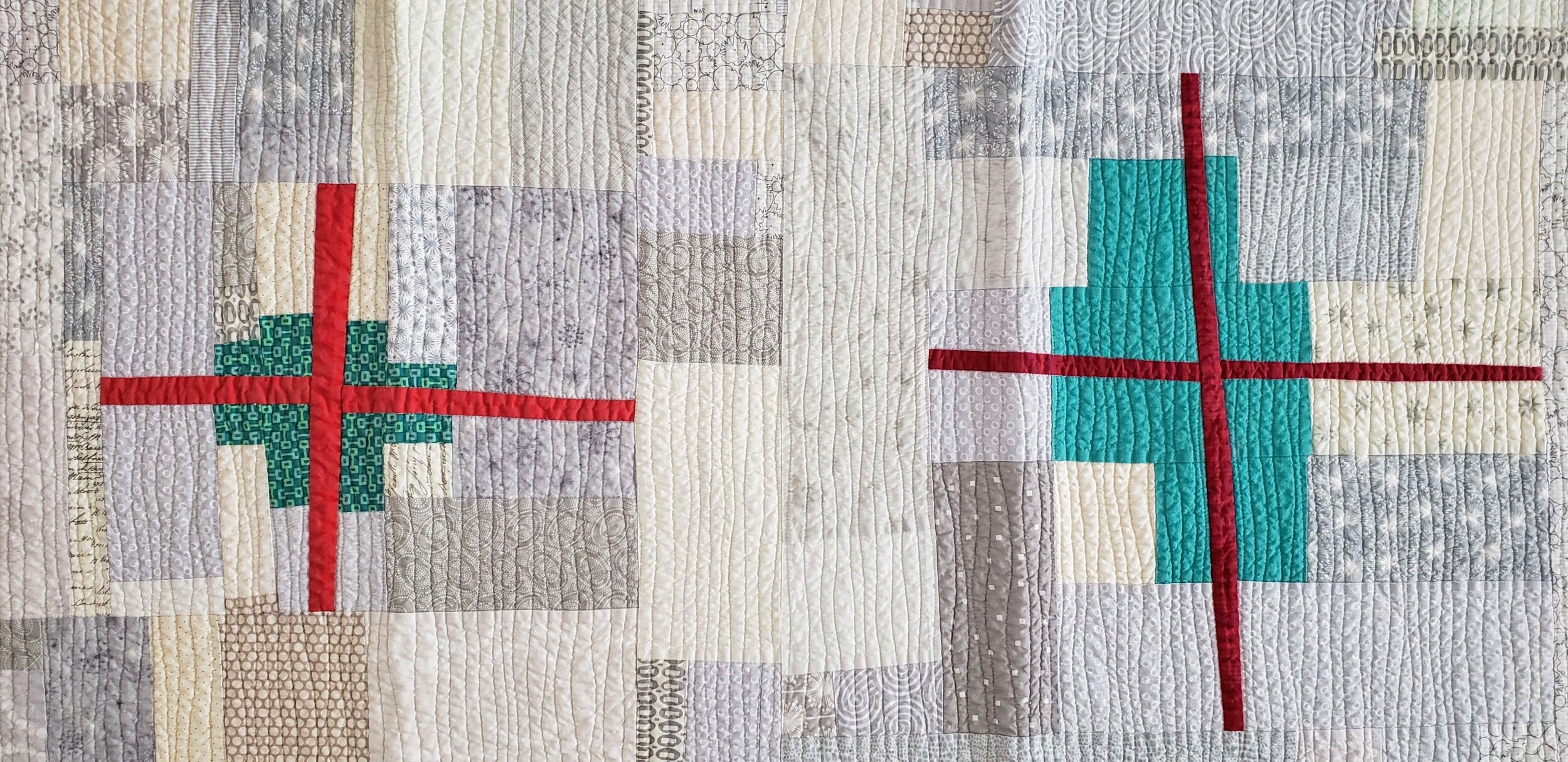
The final quilt is a slight adaptation from the original pattern. I made it one row of stars all the way around smaller. My intention is to gift this as a baby quilt so I didn’t need it to be 60” square. I also used a single piece of the background around the center section, rather than what the pattern called for. Just to show off that cool Carolyn Friedlander fabric.

So often we think things aren’t ‘for us’. I won’t lie, the book is delightful and pretty, but it isn’t something I am instinctively drawn to. More often than not, however, it is about seeing shapes or projects beyond the fabric. Kind of like viewing a house you want to buy and ignoring the colour on the walls. I’m not a basic beige person in my house, but someone else may love it. I’d rather have lime green and that can turn off a whole new crowd of people. I think we all need to look at shapes and patterns more than fabric and colour when we see a book or a new quilt. That’s why I was drawn to this pattern myself. It was the mix of block sizes and the graphic nature of the block itself that grabbed me. I just had to add my own spin on it.

Pretty in Patchwork Mills and Stars

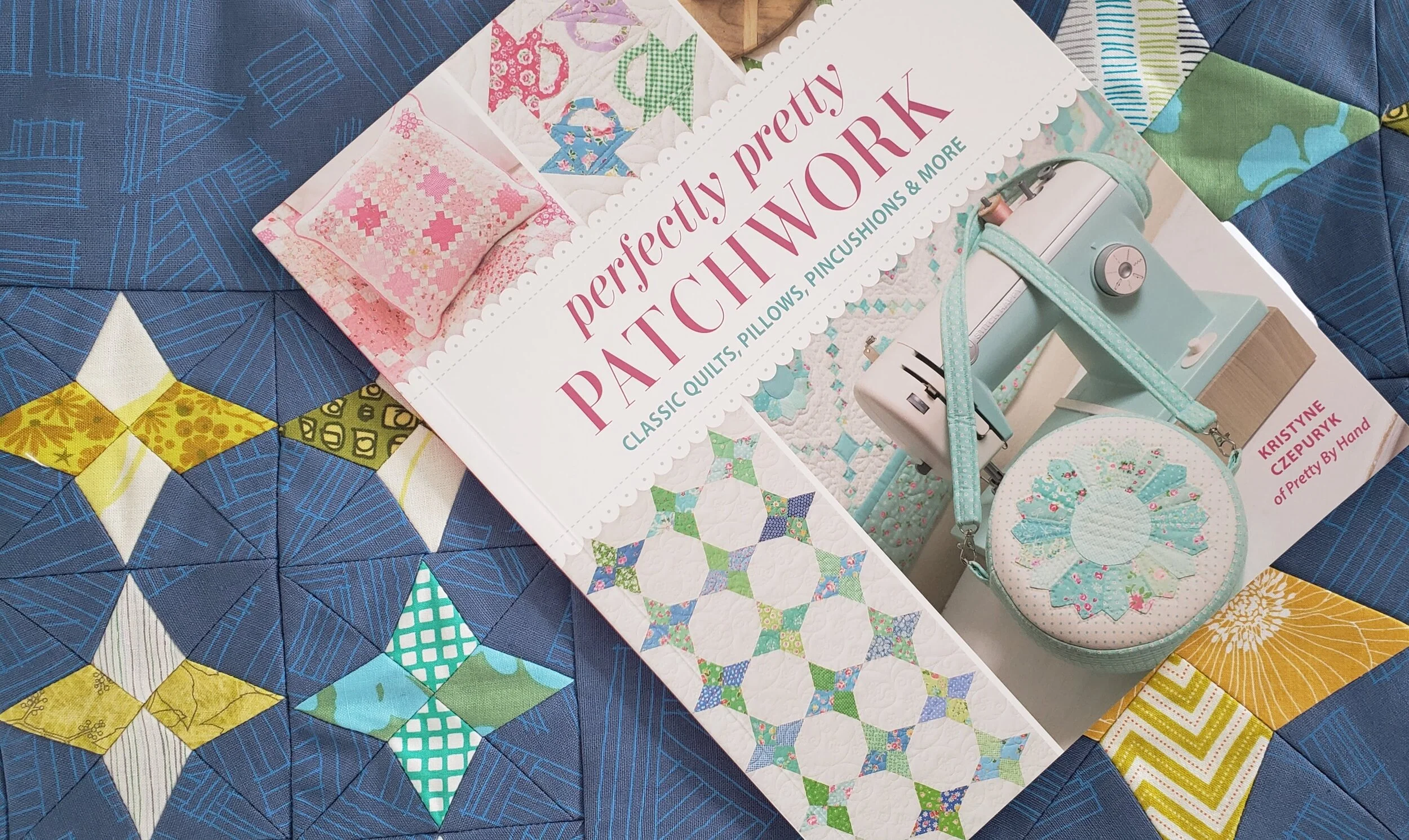
The books is full of classic designs and some really cool projects. For each block design there is a quilt pattern as well as a small project. And who is to say you can’t mix and match one block with another project? The instructions are attentive to detail, templates are included in a tear out sheet, and the photography is well, pretty. Kristyne has made a lovely book.

5 Minute Improv - Exclamation Point from Quilters' Playcation

Take a Quilters' Playcation. No demands, no requirements, just sewing. Improv quilting at its most fun! part of a series of 5 minute improv - make one block ...

Well, what can I say? These are strange, surreal times. Has anyone really processed it all yet? Can we even?

At least we can make! I’m sure we’ve all seen a meme or a joke about how quilters have always been prepared for self isolation and staying home. Of course, for those of us with kids at home or having to figure out work in all of this that presents a challenge for sure. Thinking about all the words we want to say, all the emotions we are feeling, and knowing that making helps our mental health SO MUCH I designed a simple improv block. And I filmed a tutorial to share.

Exclamation Point is the first in a series of videos I am calling 5 Minute Improv. Grab some scraps and you can make a block in 5 minutes. Sneak in the sewing when you can or make a mountain of blocks to help you process all the feelings. They are part of a bigger venture called Quilters’ Playcation. More on that soon! For now, enjoy your making. At least we still have that.

Euroa Quilt Update - Passed the Halfway Mark

Euroa quilt Cheryl Arkison

When I passed the halfway mark a few weeks ago I must admit that I had conflicting emotions. On the one hand, I was thrilled that I’d made it this far. On the other, I’d only made it this far?

My trip to Australia was nearly 4 years ago, and that is where the original inspiration for this quilt came from. The threshold to a cafe in a little town called Euroa. Turns out that tile was pretty common in Australia as I’ve heard from many people since that they or their grandparents had it in their house. I made the first block… let me check now… in April of 2017.

It took me almost 3 years to get halfway.

I do recall not touching the blocks when I had a bout of tennis elbow. That was months and months of no hand stitching (completely solved by getting a new pillow, by the way). Some weeks and months the work is constant in any down the or pool deck or outside the dance studio time. Then I may not touch a block for a few weeks.

Euroa Quilt Modern English Paper Piecing Cheryl Arkison

So yeah, I may be a bit bummed that it’s taken almost 3 years to get this far, I can fully acknowledge and appreciate that life is life. Also, I am doing this entirely by hand. That’s a lot of work adding up to something glorious. Well, I think it’s glorious.

In the end, I have no doubt that this will be a special quilt. For the memories of the inspiration, gratefulness for the moments of making, gratitude for my hands and body being able to bring this together, and pure love for the beauty. If it takes me another 3 years to finish, then so be it.

All I know is that I wold love to go back to Euroa when it is done to take a picture in its inspirational namesake.

English Paper Piecing Cheryl Arkison

For those curious…

  • Each block contains 16 pieces. I can print the templates on a piece of card stock. Indeed, I designed the templates so that they could be printed easily, that’s why each block is 8’’ square.

  • I pick the fabric for each block in a way I would refer to as controlled random. I have a stack of fabric and try not to have the same fabric too close to itself. Otherwise, I am not too fussy about it.

  • Each block gets prepped by cutting apart the template, picking the fabric, glueing the template to the fabric with a dab from a glue stick, then trimming excess fabric.

  • Thread basting works best for me. It is the most portable, a must have option for me. Also, it’s a great way to use the bit of thread left on a bobbin or spool that would otherwise be wasted.

  • Once I have all 16 pieces basted I stitch them together with a flat back stitch.

  • 4 blocks together become a mega block. 5 mega blocks become a column. There will be 5 columns in the finished quilt.

Quilt Bravely - Say Hello to Prints as Background

This is the second in a series of posts encouraging you to be different, quilt different, quilt bravely. To bend or even break some rules while pumping up your creative voice. You have the creative confidence, I’m just here to remind you of it.

Most of the first few quilts I ever made - some 2 decades ago - were pretty colours with a white background. For those first few years I couldn’t imagine how I would make a quilt any other way because it just looked so perfect to me. Well, I’m not sure what changed, but it’s been at least a decade since I made a quilt with a plain white background!

To be clear, I was almost never using plain white, a solid. No, I was using that lovely stuff called White on White, or what we used to refer to as WOW prints. A pretty shiny white ink on white fabric. Now, of course, the whites were never all the same and this row of fabrics in any quilt store will read from bright white to eggshell to cream.

Side note: if you ever find that white ink to be too bright, use the wrong side of the fabric. You get the idea of the print without the glaring brightness of the ink.

Then I discovered low volume prints. There weren’t as many then as there are now, but they definitely existed. More often than not that can still be located in the black and white section of the fabric store. Only now you can get a lot more choices of coloured ink.

I do find that people are afraid to use prints in a background, worried that they will overwhelm the design. Or, they are used and the design disappears. Here are two fundamental lessons to making sure neither thing happen.

Value Matters

Value is the relative light and dark of a fabric. The key word being relative. It is about what the fabrics look like next to each other. If you want your design to stand out, then you need good contrast between the main design components and the background. This matters especially so when all the fabrics are prints. It isn’t enough to just have colour contrast, or maybe you want a monochromatic look. Either way, making sure the value of the background prints contrast with the design elements is important.

You also want to make sure that your background prints are all of similar values. They don’t have to be match match perfect, but aim for similar. This leads to the next key lesson.

Sewing Machine Quilt, check out Pattern Drop

Sewing Machine Quilt, check out Pattern Drop

Texture Matters

Texture is the look or density of the print. Is it a sparse, large scale print with negative space between design elements? Is is a dense text print with little space. Side by side, the dense print will look darker.

It isn’t that you have to pick prints where they are all the same density, but knowing that some will pop while others will recede allows you to balance their use across a quilt. And if you have one print that really seems to be taking over the background you can do two things: remove it, or add more similar prints, so nothing stands out on its own.

Colour can make a difference in backgrounds. Be willing to experiment with pale colours instead of white. Pick multi coloured low-volume prints instead of black and white. Mix grey with black and white. Or heck, make your main design elements a light colour and your background a delicious, dark print.

Have fun playing with prints. They are a pure delight. And we have such amazing fabric designers in the world providing us with endless inspiration.

Check out the first in the Quilt Bravely Series: Creatively Contrasting Binding.

For more details on using low volume prints as background make sure to check out my book, A Month of Sundays. It gives you all the lessons!